
Tagible for Travel
Helps travel companies increase bookings by inspiring potential customers to take action.

Idea
To book a tour, a consumer needs to be inspired, informed and validated about the trip. 62% of the travelers say that media content has the biggest influence on decision-making. The problem is that it’s nearly impossible for travel companies to collect, organize and display media content like photos, 3D panoramas and videos effectively. So, we developed Tagible for Travel to help travel companies increase bookings by inspiring potential customers to take action. Just one JS code line integrated into the client’s site lets them add the keywords which contain photos, videos, and 3D views to engage customers and motivate users to book a tour.
Estimate
We have got the project idea in April 2016 and came up with the first designs in May. As a next step, we started working on a MVP and finished the prototype in July, which we were updating for the next two months. The project activities included:
-
Design
-
Web/Server
-
Quality Assurance
-
Project management
Discovery
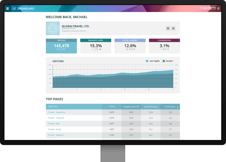
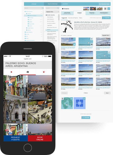
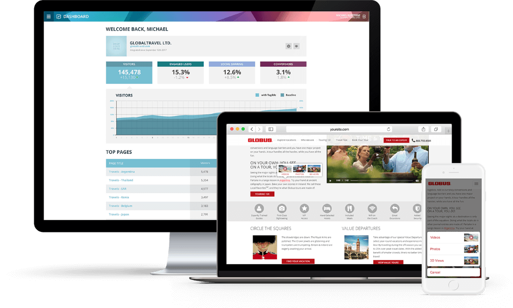
Tagible for Travel admin panel has two different modes: for customers and for content curators. Customer mode contains dashboard with “Curate site” option to manage content on the site directly and analytics with data comparison with and without Tagible for Travel usage.
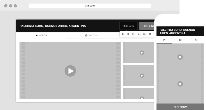
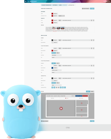
The keywords look entirely native to each client site, as Tagible for Travel’s overlay styles are customized for every customer according to the corporate identity, design style and colour scheme. The pop-ups with media content are displayed for every keyword with a simple click.To increase conversion each popup has a call to action like “Book online” or “Get a quote” that are replicating native client site’s call to action buttons.
There was a challenge to curate millions of keywords and their variants. For example, customers use different spellings for the same keyword, so we decided to group them to reduce curation time and costs. For example, “Paris” keyword contains “Paris”, “PARIS”, “City of Light” and some other spellings, but as a group it was curated once.
What We Created
The primary goal of the project is to increase the conversion and time spent on the site by engaging users with rich media content that most of the travel sites don’t have. So, in design, we focused on UX.
Master’s comment
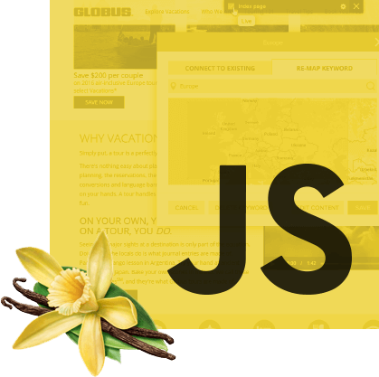
For Tagible for Travel, we have used pure JS as a frontend technology which is extremely fast because no frameworks are used, just pure JavaScript. It was one of the main targets to make a quick and scalable solution to satisfy any client site implementation and platform. Our frontend script is working inside the client’s site architecture. So we needed to implement a solution, that would not break the client's frontend code and will work in any environment and framework. Tagible for Travel clients only need to add only one simple line of our script to their site code and that's all to be done to receive a rich media content on any approved page of a site. All other stuff our code does under that single line.
As for the backend, Tagible for Travel provided us with an opportunity to use rather new and promising Go programming language by Google as the primary technology for developing backend part.
Master’s comment
Go is all about building a flexible microservice architecture with a clear and easy separation of execution of objectives across multiple services and console applications. The choice of this technology was influenced by the need to ease the scaling and interaction between system components, as well as targeting simple concurrency implementation and execution speed for special tasks processing media content. Also, The usage of IBM Alchemy and PhantomJS for analyzing web pages can be mentioned among the most remarkable and extraordinary features of this project.
As we had to build MVP first, we needed some quick solution.
Master’s comment
First the project was developed in Symfony 2 for quick development of MVP version. Now Symfony is used only for rendering backend admin area that is a collection of single page JS applications. The whole API for frontend and backend is developed in Go. With the help of Go language, we have implemented several separate microservices: API, client sites analyzer, media content importers and synchronization, and daily statistics processor. Frontend consists of 2 parts: backend admin area (implemented as a bunch of single page JS applications using Backbone.JS) and the client side (written without using any third-party libraries excepting Google Maps to display panoramas to minimize the script size and maximize its working speed on client sites).
Using Golang increases the performance by up to 60% compared to other backend languages such as PHP, Ruby or even JAVA.
-
Duration
24 months -
Team size
5 people -
Platform
Web -
Industry
Entertainment and Media
Technology
- pagination-wrap
- pagination-wrap

Launch
First clients were integrated with the system and began live at the end of August 2016 and we continue our work with the project till now with our eye on integrations.
Support
We continue with integrations with new customers, develop new locations, add media content and curate the changes via admin panel.


Master’s comment
Bohdan Doshchak — UI/UX Designer